http://pentagram.com/en/new/2012/02/new-work-microsoft.php
E um update ao post no brand new http://www.underconsideration.com/brandnew/archives/with_windows_like_these_who_needs_enemies.php
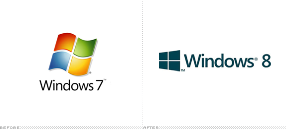
(Segoe) It’s a fine font, but pretty it is not. It’s a kind of middle-of-the-road sans serif without any memorable attributes and with a very peculiar “Default” aesthetic to it. It works best as a user interface ingredient but as the typography on a logo, it’s extremely underwhelming — pair it with the worst rendition yet of the Windows window and you have a real loser. I’m not saying the previous Windows icons were good, but they had enough abstraction (and gradients and shadows and highlights) to at least look techie and Microsoft-ey, but this “minimal” approach looks like, well, a window. A window in a $400-a-month studio apartment rental with beige carpeting and plastic drapes. Moving away from the more flag-like icon seems like abandoning two decades of equity — crappy equity, but equity nonetheless.http://www.underconsideration.com/brandnew/archives/with_windows_like_these_who_needs_enemies.php

Yesterday, DC Comics officially unveiled its new identity, after the whole internet (including us) stole its thunder at the start of the week when we all judged its new branding effort based on a single, black-and-white rendition of their new logo. Now it’s an uphill battle to get people on board with what is actually a fairly good looking and flexible identity designed by Landor.http://www.underconsideration.com/brandnew/archives/follow-up_dc_comics.php