With Windows Like These Who Needs Enemies?
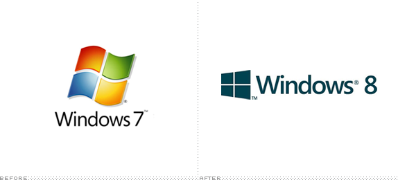
(Segoe) It’s a fine font, but pretty it is not. It’s a kind of middle-of-the-road sans serif without any memorable attributes and with a very peculiar “Default” aesthetic to it. It works best as a user interface ingredient but as the typography on a logo, it’s extremely underwhelming — pair it with the worst rendition yet of the Windows window and you have a real loser. I’m not saying the previous Windows icons were good, but they had enough abstraction (and gradients and shadows and highlights) to at least look techie and Microsoft-ey, but this “minimal” approach looks like, well, a window. A window in a $400-a-month studio apartment rental with beige carpeting and plastic drapes. Moving away from the more flag-like icon seems like abandoning two decades of equity — crappy equity, but equity nonetheless.
http://www.underconsideration.com/brandnew/archives/with_windows_like_these_who_needs_enemies.php

Sem comentários:
Enviar um comentário
Nota: só um membro deste blogue pode publicar um comentário.