Relembramos que os manuais podem ser levantados na sala do funcionário no pav. sul.
Boas férias!
Relembramos que os manuais podem ser levantados na sala do funcionário no pav. sul.
Boas férias!

O enunciado da última proposta de trabalho já se encontra disponível na respetiva página.
Relembra-se ainda que a proposta de trabalho 6.4 deverá ser entregue sem falta (em CD/DVD) na aula de 31/05.
Os projetos apresentados hoje poderão ser melhorados e entregues na próxima aula (29/05).
Bom trabalho.
| Data | Hora | Grupos |
| 24/05 | 8:40 | Susana, Alexandra, Inês |
| 9:00 | Mariana Mota, Micá Cardeiro, Mimi Cardeiro, Laura Ferrari | |
| 9:20 | Rui, César, Pedro, Zé | |
| 9:40 | Ana Torres, Élodie Mota, Rita Mendes, Eliana Pires | |
| 10:00 | Gil, Sara, Catarina, Ruben | |
| 10:20 | Joana Carvalho, David Rodrigues, Luís Batalha | |
| 10:40 | Luciana, Maris, Magda, Su | |
| 11:00 | Francisca Trevisan, Mariana Cardoso, Catarina Lencastre, Rafaela Abreu | |
| 11:20 | Heloisa, Marta, Leila | |
| 11:40 | Sofia Peres, Teresa Almeida, Mariana Silva, Joana Fachana | |
| 12:00 | Helena Morais, Jéssica Teixeira, Tânia Silva, Mariana Owen | |
| 29/05 | 8:40 | André Resendes, Pedro Brandão, Manuel Melo |
| 9:00 | Cláudia Castro, Diana Marcelino, Joana Valadão, Maria Santos | |
| 9:20 | Antónia, Francisca, Ludovika |


The Victoria and Albert Museum has commissioned the artist Karsten Schmidt to design a truly malleable, digital identity for the Decode exhibition by providing it as open source code. We are giving you the opportunity to recode Karsten's work and create your own original artwork. If we love your work it might even become the new Decode identity.
At http://postspectacular.com/work/decode/start and http://code.google.com/p/decode/

At http://postspectacular.com/work/onedotzero/start and http://code.google.com/p/onedotzero-ident/
(…) media on which corporate identities are depicted have changed. We're now just as likely to see a logo flickering on a computer or cellphone screen, as printed on a company's stationery or a billboard. "Once you'd design a logo for a company, and you'd have to get it exactly right because, when it launched, it was going to be painted on the side of tanker trucks, hung off the side of skyscrapers and printed in closetfuls of letterhead," Bierut said. "You got one chance with no do- overs. Nowadays our main experience of a logo like Google's is the way it looks when it loads on a computer screen. It costs next to nothing to change it every time. So why not?"
It's easy to see why dynamic identities should strike a chord with today's spoiled, impatient and — to give us some credit — visually savvy consumers, but there are instances where the old-fashioned approach works best. "MTV has a dynamic identity because they are dynamic, and I want them to be," Mau said. "But I don't want my bank to be dynamic. I want them to be conservative and radically stable."
At http://www.nytimes.com/2007/02/11/style/11iht-design12.html?_r=2.

During the research phase of a recent identity project, we spent some time revisiting numerous examples of what we like to call “fluid identities” — logo systems that use multiple iterations of a mark (or series of marks) to communicate a particular aspect of a brand. These might take the form of a logo that changes with each viewing, or a singular mark that gets impregnated with different imagery, depending on the context. At one point, these types of projects were few and far between, but now these isolated examples have grown into a full-blown trend. The days of the static logo are certainly not extinct, but this persistent way of thinking about malleable identities seems like a portend of things to come.http://www.hexanine.com/zeroside/the-future-is-fluid-inside-dynamic-logos/
O emblema do Praça da Alegria Futebol Clube e as marcas dos apoios do evento podem ser descarregados aqui.
Informam-se todos os alunos que a proposta de trabalho 7 está publicada na devida página. Recomenda-se que os grupos (que podem agregar elementos de ambas as turmas) se formem antecipadamente, elegendo os respetivos líderes. Pretende-se que demonstrem iniciativa e discutam previamente algumas ideias, de modo a gerir o tempo disponível da melhor forma.
Sobre a Associação:
"A sede do Praça da Alegria Futebol Clube (a.k.a. 'O Praça ') situa-se na Avenida Rodrigues de Freitas, 207. A associação recebe a comunidade de Belas Artes quase diariamente onde, entre jantaradas e festas de aniversário, já se realizaram pequenos simpósios, exposições, projecções de cinema, concertos, noites de fados, feiras de artesanato, etc.. 'O Praça' está aberto a propostas da comunidade, sendo um espaço dinâmico de colaboração e sinergias (mas também de matrecos).
A associação abre o espaço por volta das 15:00 todos os dias da semana, interrompe ao final da tarde entre as 19h30 e as 8h30/21h00, e fecha às 00h00 (supostamente). Às quintas-feiras fecha pela 01h00/01h30. Sextas-feiras e sábados mantém-se aberto enquanto houver movimento."
torneiodematraquilhos@gmail.com
www.facebook.com/Torneio.de.Matrecos
Estarei disponível para atendimento quarta-feira (11/04) a partir das 15:00, mediante marcação por email. Sala 303, Pav Carlos Ramos.
Pedro Cardoso.As memórias descritivas relativas à P06.2 deverão ser enviadas por email, em formato pdf, até ao fim do dia de hoje.
Pedro Cardoso.

Comunica-se a todos os alunos que a data de entrega da proposta de trabalho 6.2 foi adiada para quinta-feira (dia 22/03), sendo que na terça-feira (20/03) deverão fazer obrigatoriamente uma pré-entrega com os posters já paginados, para que possam ser efetuadas as devidas correções.
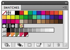
Converting RGB colors to CMYK for printing purposes or Color Management, is something we designer have to deal with almost every day. It’s easy to get information about Color Management in books and on the web. I am not going to go through that here but concentrate on other less common conversions.
http://font.is/?p=1277Converting colors between color systems is a never ending story for designers. Much of the converting can be done by the method described in a previous article on this site. There is one conversion not possible there, one that most designers are not aware of how to do easily: How to find what Pantone color best matches their CMYK matches.
http://font.is/?p=1293Official video about the creative process of the first multisensory brand in the history of the paralympic games, created by Tatil Design for the Rio 2016 event.
Mais info at http://vimeo.com/34569203
Para quem ainda não conhece a marca:
Mais info at http://www.underconsideration.com/brandnew/archives/holding_hands_in_rio.php
 Building a massive space weapon is all very well, but you have to find the materials to build it with. It's easy to say that "sure, the Death Star would be expensive" but is there actually enough iron in the Earth to make the first Death Star? Centives decided to find out.
David A Smith is a name that has become synonymous in Sign-Writing and Glass gilding circles, with high quality, hand crafted reverse glass signs and decorative silvered and gilded mirrors. In this short documentary, we reveal behind the scenes work, techniques and visions that Dave uses when carrying out his passion as a glass embosser - One of the few remaining traditional UK glass artists.
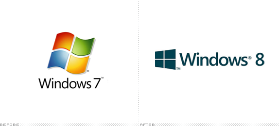
(Segoe) It’s a fine font, but pretty it is not. It’s a kind of middle-of-the-road sans serif without any memorable attributes and with a very peculiar “Default” aesthetic to it. It works best as a user interface ingredient but as the typography on a logo, it’s extremely underwhelming — pair it with the worst rendition yet of the Windows window and you have a real loser. I’m not saying the previous Windows icons were good, but they had enough abstraction (and gradients and shadows and highlights) to at least look techie and Microsoft-ey, but this “minimal” approach looks like, well, a window. A window in a $400-a-month studio apartment rental with beige carpeting and plastic drapes. Moving away from the more flag-like icon seems like abandoning two decades of equity — crappy equity, but equity nonetheless.http://www.underconsideration.com/brandnew/archives/with_windows_like_these_who_needs_enemies.php

This is a list of notable and commonly used emoticons or textual portrayals of a writer's mood or facial expression in the form of icons. The Western use of emoticons is quite different from Eastern usage, and Internet forums, such as 2channel, typically, show expressions in their own ways. In recent times, graphic representations, both static and animated, have taken the place of traditional emoticons in the form of icons.http://en.wikipedia.org/wiki/List_of_emoticons
Peço que enviem a versão digital (em formato PDF) da proposta 5 para o meu email.
Bom trabalho,
Pedro Cardoso.

Yesterday, DC Comics officially unveiled its new identity, after the whole internet (including us) stole its thunder at the start of the week when we all judged its new branding effort based on a single, black-and-white rendition of their new logo. Now it’s an uphill battle to get people on board with what is actually a fairly good looking and flexible identity designed by Landor.http://www.underconsideration.com/brandnew/archives/follow-up_dc_comics.php
If you’ve ever gone looking for legitimately free fonts, you’ve probably found that there are a lot of really bad ones. But there’s also a lot of discussion out there about “open source fonts.”http://magazine.redhat.com/2007/12/13/open-source-fonts/
The league of movable type

There are people who design typefaces for a living, and we want them to make money off of something that they do well. This revolution is not a movement against type foundries and type designers; it’s quite the opposite. The kind of revolution we want is a change in the way people think about doing business.http://www.theleagueofmoveabletype.com/
Open Font Library
The mission of the Open Font Library is to promote your freedoms as it relates to the use of type. All of the fonts that appear on this site come with the freedom to use, study, share and remix them.http://openfontlibrary.org/

Unevolving a logo to just a series of coloured circles, how many can still be recognised? Logo and brands that have strong and unique colours, as well as strong positional aspects, are usually recognisable when Unenvolved to just circles.http://imjustcreative.com/unevolvedbrands/

A Brand Reversion is a brand logo that has undertaken a creative change based on the visual style of another brand logo: Brand identities with a split personality


“It started with the simple logo and name, suggested, allegedly, by a typist who was earwigging the board meeting. Allen had already hit upon the idea of an animal logo, inspired by the template offered by the contemporary publishing house The Albatross Library. “It was the obvious answer, a stroke of genius,” said Penguin’s original designer, Edward Young. “I went straight off to the zoo to spend the rest of the day drawing penguins in every pose.” The clear logo was matched with the archetypal modern, but not too scarily modern, typeface, Gill Sans, and the now classic three-band cover, with colours related to the subject: orange for fiction, dark blue for biography, etc.”
At http://www.logodesignlove.com/penguin-logo

At http://dustyburrito.blogspot.com/2009/12/penguin-group-logos.html


At http://www.creativereview.co.uk/cr-blog/2006/october/benetton-hits-middle-age
In the history of attention-getting advertising, writes Rick Poynor, Benetton must surely deserve a place as one of the most effective companies ever to splash its promotional message across a billboard or magazine spread.

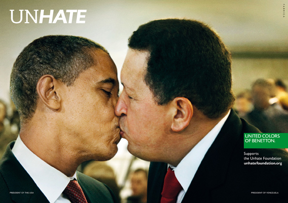
A new campaign from Benetton recalls the brand's controversial heyday. A series of posters features world leaders with lips locked to launch the UNHATE project.
Benetton, says the accompanying press material, is inviting "the leaders and citizens of the world to combat the 'culture of hatred'". The UNHATE campaign is the first initiative from a new Benetton foundation of the same name, launched by Alessandro Benetton, executive deputy chairman of the Benetton Group.
At http://www.creativereview.co.uk/cr-blog/2011/november/benetton-unhate
At http://www.ted.com/talks/lang/en/scott_mccloud_on_comics.html
In this unmissable look at the magic of comics, Scott McCloud bends the presentation format into a cartoon-like experience, where colorful diversions whiz through childhood fascinations and imagined futures that our eyes can hear and touch.