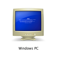
That’s how the icon for a computer with Windows looks in a networked environment of Macs. The joke by the designers10 Outstanding Metaphors in Icon Designfilibustersat Apple was a little obscure, but a bit coarse.
Once, we needed an icon for a data filter, which is often portrayed using the metaphor of a funnel. It was drawn like this:10 Mistakes in Icon DesignThe client’s response was as follows: “I do not really understand why for a filter, you drew an icon shaped like a Martini glass!”

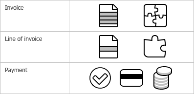
The surefire way of creating a set of icons falling apart along the way is to start generating icons one after another, in the alphabetic order, without looking ahead and with no clear vision of the whole picture. The opposite approach is what we call “designing an iconic language”. This method is described in details in the book by William Horton, “The Icon Book”. And now I will try to demonstrate you an example of what it is and how it is implemented.Designing an iconic language
Does that mean that the only useful function of icons is to help users with dull sight? In fact, no. But this example demonstrates that an icon unlike text can have properties for locating it on the screen. These properties are shape and color. Text messages are not different from each other by shape or color. To distinguish one message from another you need to read it. In the event with icons, you need just a quick glance.What icons are for
