Páginas

Mostrar mensagens com a etiqueta brand. Mostrar todas as mensagens

quarta-feira, 2 de maio de 2012

PostSpectacular: V&A Decode open source identity & onedotzero generative identity

V&A Decode

The Victoria and Albert Museum has commissioned the artist Karsten Schmidt to design a truly malleable, digital identity for the Decode exhibition by providing it as open source code. We are giving you the opportunity to recode Karsten's work and create your own original artwork. If we love your work it might even become the new Decode identity.

At http://postspectacular.com/work/decode/start and http://code.google.com/p/decode/


Onedotzero

At http://postspectacular.com/work/onedotzero/start and http://code.google.com/p/onedotzero-ident/

terça-feira, 24 de abril de 2012

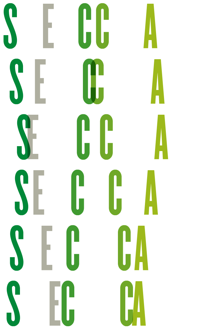
The future is fluid: inside dynamic logos

During the research phase of a recent identity project, we spent some time revisiting numerous examples of what we like to call “fluid identities” — logo systems that use multiple iterations of a mark (or series of marks) to communicate a particular aspect of a brand. These might take the form of a logo that changes with each viewing, or a singular mark that gets impregnated with different imagery, depending on the context. At one point, these types of projects were few and far between, but now these isolated examples have grown into a full-blown trend. The days of the static logo are certainly not extinct, but this persistent way of thinking about malleable identities seems like a portend of things to come.
http://www.hexanine.com/zeroside/the-future-is-fluid-inside-dynamic-logos/

segunda-feira, 5 de março de 2012

sexta-feira, 17 de fevereiro de 2012

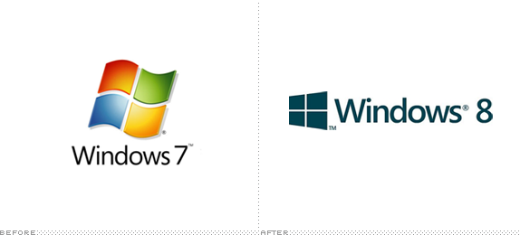
With Windows Like These Who Needs Enemies?

(Segoe) It’s a fine font, but pretty it is not. It’s a kind of middle-of-the-road sans serif without any memorable attributes and with a very peculiar “Default” aesthetic to it. It works best as a user interface ingredient but as the typography on a logo, it’s extremely underwhelming — pair it with the worst rendition yet of the Windows window and you have a real loser. I’m not saying the previous Windows icons were good, but they had enough abstraction (and gradients and shadows and highlights) to at least look techie and Microsoft-ey, but this “minimal” approach looks like, well, a window. A window in a $400-a-month studio apartment rental with beige carpeting and plastic drapes. Moving away from the more flag-like icon seems like abandoning two decades of equity — crappy equity, but equity nonetheless.
http://www.underconsideration.com/brandnew/archives/with_windows_like_these_who_needs_enemies.php

terça-feira, 24 de janeiro de 2012

DC Comics Logo

Yesterday, DC Comics officially unveiled its new identity, after the whole internet (including us) stole its thunder at the start of the week when we all judged its new branding effort based on a single, black-and-white rendition of their new logo. Now it’s an uphill battle to get people on board with what is actually a fairly good looking and flexible identity designed by Landor.
http://www.underconsideration.com/brandnew/archives/follow-up_dc_comics.php

quarta-feira, 18 de janeiro de 2012

Unevolved, reversed, and 8-bit brands

Unevolving a logo to just a series of coloured circles, how many can still be recognised? Logo and brands that have strong and unique colours, as well as strong positional aspects, are usually recognisable when Unenvolved to just circles.
http://imjustcreative.com/unevolvedbrands/
http://www.flickr.com/photos/grahamsblog/sets/72157625155090078/

A Brand Reversion is a brand logo that has undertaken a creative change based on the visual style of another brand logo: Brand identities with a split personality

http://www.imjustcreative.co.uk/brandreversioning/
http://www.flickr.com/photos/grahamsblog/sets/72157626620633288/

8-bit Chrome Logo
http://www.flickr.com/photos/grahamsblog/sets/72157626659260240/

quarta-feira, 11 de janeiro de 2012

Penguim

“It started with the simple logo and name, suggested, allegedly, by a typist who was earwigging the board meeting. Allen had already hit upon the idea of an animal logo, inspired by the template offered by the contemporary publishing house The Albatross Library. “It was the obvious answer, a stroke of genius,” said Penguin’s original designer, Edward Young. “I went straight off to the zoo to spend the rest of the day drawing penguins in every pose.” The clear logo was matched with the archetypal modern, but not too scarily modern, typeface, Gill Sans, and the now classic three-band cover, with colours related to the subject: orange for fiction, dark blue for biography, etc.”

At http://www.logodesignlove.com/penguin-logo

At http://dustyburrito.blogspot.com/2009/12/penguin-group-logos.html

Penguin symbols, front cover

At http://www.flickr.com/photos/32610318@N06/sets/72157621950920167/detail/

segunda-feira, 9 de janeiro de 2012

Benetton Again

At http://www.creativereview.co.uk/cr-blog/2006/october/benetton-hits-middle-age

In the history of attention-getting advertising, writes Rick Poynor, Benetton must surely deserve a place as one of the most effective companies ever to splash its promotional message across a billboard or magazine spread.

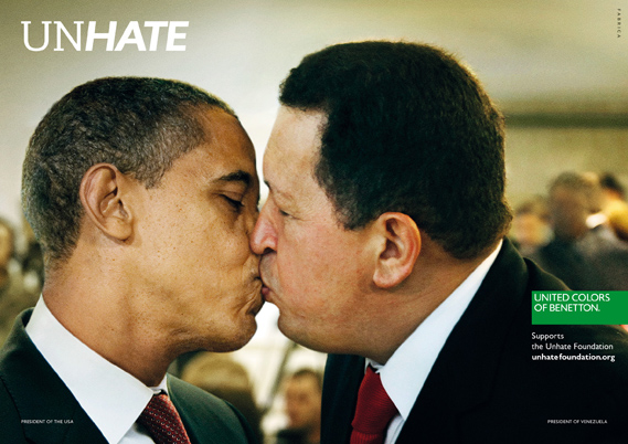
Benetton wants the world to UNHATE

A new campaign from Benetton recalls the brand's controversial heyday. A series of posters features world leaders with lips locked to launch the UNHATE project.

Benetton, says the accompanying press material, is inviting "the leaders and citizens of the world to combat the 'culture of hatred'". The UNHATE campaign is the first initiative from a new Benetton foundation of the same name, launched by Alessandro Benetton, executive deputy chairman of the Benetton Group.

At http://www.creativereview.co.uk/cr-blog/2011/november/benetton-unhate

http://unhate.benetton.com/