
sexta-feira, 23 de dezembro de 2011

quinta-feira, 15 de dezembro de 2011
Notificações
Relembra-se que a sessão de apresentações será retomada na primeira aula de Janeiro.
Informa-se também que o enunciado da proposta de trabalho, apresentada hoje em aula, já está disponível online.
Boas festas.
Informa-se também que o enunciado da proposta de trabalho, apresentada hoje em aula, já está disponível online.
Boas festas.
domingo, 11 de dezembro de 2011
Icons, Icons, Icons
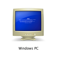
That’s how the icon for a computer with Windows looks in a networked environment of Macs. The joke by the designers10 Outstanding Metaphors in Icon Designfilibustersat Apple was a little obscure, but a bit coarse.
Once, we needed an icon for a data filter, which is often portrayed using the metaphor of a funnel. It was drawn like this:10 Mistakes in Icon DesignThe client’s response was as follows: “I do not really understand why for a filter, you drew an icon shaped like a Martini glass!”

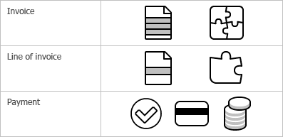
The surefire way of creating a set of icons falling apart along the way is to start generating icons one after another, in the alphabetic order, without looking ahead and with no clear vision of the whole picture. The opposite approach is what we call “designing an iconic language”. This method is described in details in the book by William Horton, “The Icon Book”. And now I will try to demonstrate you an example of what it is and how it is implemented.Designing an iconic language
Does that mean that the only useful function of icons is to help users with dull sight? In fact, no. But this example demonstrates that an icon unlike text can have properties for locating it on the screen. These properties are shape and color. Text messages are not different from each other by shape or color. To distinguish one message from another you need to read it. In the event with icons, you need just a quick glance.What icons are for
sexta-feira, 9 de dezembro de 2011

quinta-feira, 8 de dezembro de 2011

quarta-feira, 7 de dezembro de 2011
Privacy Icons

The Privacy Icon makes an iron-clad guarantee about some portion of how a company treats your data. This method means that without ever having to delve into the details, everyday people can glance at the simple icons atop a privacy to know if and how their data is being used. At the same time, it gives companies the flexibility required to create comprehensive and meaningful policies.
http://www.azarask.in/blog/post/privacy-icons/
http://www.azarask.in/blog/post/what-should-matter-in-privacy/
terça-feira, 6 de dezembro de 2011
Alteração dos prazos P04
Informam-se todos os discentes que os prazos da proposta de trabalho 4 foram alterados para:
Entrega em formato digital: 14/12/2011, 19:00;
Apresentação: 15/12/2011, 8:30 AM.
sexta-feira, 2 de dezembro de 2011
Done Manifesto

These maxims are really a super concise and clear way of restating one of the founding tenets of so-called design thinking: The idea of creating prototypes as soon as you can, and failing as fast as possible so you can evolve your way to something great. It isn't to say that you have to make these failures public. But the failures have to be made and not just thought about. Get it done.http://www.fastcodesign.com/1665527/infographic-of-the-day-13-rules-for-realizing-your-creative-vision
quarta-feira, 30 de novembro de 2011
Sketching

Sketching: the Visual Thinking Power Tool
http://www.alistapart.com/articles/sketching-the-visual-thinking-power-tool/

To Sketch or not to Sketch? That is the Question
http://designinformer.smashingmagazine.com/2010/03/04/sketch-question/

Offsetters Development Sketches
Get ready to scroll.
http://identitydesigned.com/offsetters/
segunda-feira, 28 de novembro de 2011
sexta-feira, 25 de novembro de 2011

quinta-feira, 24 de novembro de 2011

The Pratical Aplication of Pictograms
http://www.pictogram.se/products/8805-practicalapp_pictogram.pdf

quarta-feira, 23 de novembro de 2011
terça-feira, 22 de novembro de 2011
domingo, 20 de novembro de 2011
Univers Revolved

Univers Revolved is a three-dimensional alphabet. It invites the readers to play with their imaginative mind and think beyond the conventions of their familiar reading method.http://universrevolved.com/4.About%20Univers%20Rev/Aboutframeset.htm
sexta-feira, 18 de novembro de 2011

terça-feira, 15 de novembro de 2011
Atendimento
Caros alunos,
Estarei disponível para atendimento amanhã à tarde a partir das 17:00, mediante marcação prévia, via email.
Pedro Cardoso
Estarei disponível para atendimento amanhã à tarde a partir das 17:00, mediante marcação prévia, via email.
Pedro Cardoso
segunda-feira, 14 de novembro de 2011
prototyp-0
L’application prototyp-0 est spécialement conçue pour le dessin de caractère. Grâce au procédé automatisé, prototyp-0 accélère considérablement le processus de création, permettant ainsi de générer dans un délai très court une multiplicité de polices typographiques complètes. Pour correspondre à ses critères, l’utilisateur pourra régler une vingtaine de paramètres (graisse, chasse, hauteur d’X, empattements, etc.)http://www.yannickmathey.com/prototyp
domingo, 13 de novembro de 2011

sexta-feira, 11 de novembro de 2011
Ubuntu Font Family
http://font.ubuntu.com/The Ubuntu Font Family are a set of matching new libre/open fonts. The development is being funded by Canonical on behalf the wider Free Software community and the Ubuntu project. The technical font design work and implementation is being undertaken by Dalton Maag.
Both the final font Truetype/OpenType files and the design files used to produce the font family are distributed under an open licence and you are expressly encouraged to experiment, modify, share and improve. The typeface is sans-serif, uses OpenType features and is manually hinted for clarity on desktop and mobile computing screens.
The scope of the Ubuntu Font Family includes all the languages used by the various Ubuntu users around the world in tune with Ubuntu's philosophy which states that every user should be able to use their software in the language of their choice. So the Ubuntu Font Family project will be extended to cover many more written languages.
http://www.google.com/webfonts/specimen/Ubuntu
http://en.wikipedia.org/wiki/Ubuntu_Font_Family
About Ubuntu Code of Conduct
quinta-feira, 10 de novembro de 2011
Helvetica and Alternatives to Helvetica
http://fontfeed.com/archives/helvetica-and-alternatives-to-helvetica/Helvetica is a classic. Helvetica is played out. Each of these statements is true to an extent. The world’s most recognizable typeface will soon star in a new film that documents both its omnipresence and its timelessness.
There are many reasons why Helvetica is so widespread. The most obvious being that a few weights have been bundled with the Mac OS for years. It is arguably the most respectable of the “default” fonts. But it’s also used because it’s a safe, neutral choice. For many purposes, typography is more about content than style. Fans of Beatrice Warde will tell you that typographers should communicate without distraction. Helvetica, with its simple, unadorned forms, is the perfect crystal goblet. Even its ubiquity contributes to its neutrality — letters so common they become invisible.
But invisibility isn’t always appropriate, particularly in advertising or branding where individuality is key. Here we recommend our favorite fonts from the grotesque genre that offer something different from Helvetica (or Arial) — whether it’s style, warmth, or extra features like small caps, figure alternates, and additional widths.
terça-feira, 8 de novembro de 2011
Arial & Helvetica


How to spot Arial
"Many of the characters in Helvetica and Arial are very similar to each other, although none are quite identical. Other characters are quite a bit different, and they are the key to telling which is which. Here are some of the most obvious ones (Grotesque 215, Arial’s ancestor, has also been included for comparison)(…)"
Arial versus Helvetica
"Every typeface, like every one of us, has its distinguishing features. You might be forgiven for thinking that some fonts are clones, or identical twins. However, closer inspection reveals subtle differences and nuances that simply escape casual perusal. Something that can really help to heighten our sensitivity to those differences is getting out our magnifying glasses and really taking a closer look."
The Scourge of Arial
"Arial is everywhere. If you don’t know what it is, you don’t use a modern personal computer. Arial is a font that is familiar to anyone who uses Microsoft products, whether on a PC or a Mac. It has spread like a virus through the typographic landscape and illustrates the pervasiveness of Microsoft’s influence in the world."
segunda-feira, 7 de novembro de 2011

domingo, 6 de novembro de 2011
quinta-feira, 3 de novembro de 2011
Pentagram
http://www.pentagram.com/work/#/all/all/newest/
é uma empresa de design com alguns projectos de criação de logótipos e cartazes aonde o uso da tipografia e elementos gráficos estão presentes.
é uma empresa de design com alguns projectos de criação de logótipos e cartazes aonde o uso da tipografia e elementos gráficos estão presentes.
Vários - ícones e narrativa
Rebus

Eye Bee M poster designed by Rand in 1981 for IBM.
http://en.wikipedia.org/wiki/Rebushttp://en.wikipedia.org/wiki/Paul_Rand
segunda-feira, 31 de outubro de 2011
Unique Types
Nosewritten by Welab
Unique Types is a mobilization against prejudice. Using the fonts, you support AACD cause, showing the phisically disabled children can do almost everything other people can.
http://uniquetypes.cc/index_en.html
http://www.uniquetypes.cc/designers/index_en.html

quarta-feira, 26 de outubro de 2011
Notificação
A aula de apresentação da proposta de trabalho 2 (27/10) decorrerá na Aula Magna. Relembra-se que a presença de todos os discentes ao longo de toda a sessão é obrigatória. A sessão terá início às 8:30 AM para que possam ser efectuados os devidos preparativos, sendo que as apresentações iniciarão às 8:45 AM. As versões impressas deverão ser entregues no início da sessão para que possam ser consultadas aquando a respectiva apresentação.
terça-feira, 25 de outubro de 2011
The League of Moveable Type

http://theleagueofmoveabletype.com/
sexta-feira, 21 de outubro de 2011
quinta-feira, 20 de outubro de 2011
P02: A Tipografia Suiça do Weingart
Formato Analógico
Data: 27.10.2011 8:30AM
A4 ao alto/portrait encadernado
Conteúdo:
- 36 exercícios de acordo com o enunciado.
Todas as páginas deverão ter referenciada(s) a(s) fonte(s) e tamanho(s) utilizadas no respectivo exercício em Helvetica 8pt K=40)
- Memória descritiva.
- Capa com Nome e Apelido (K=100).
- Separador para cada fase 1, 2, 3 e 4.
Formato Digital
Data: 26.10.2011 19:PM
A4 deitado/landscape, Nome-Apelido.pdf
Conteúdo:
- 8 slides (2 slides de cada fase).
- 1 slide inicial com Nome e Apelido (Helvetica Regular 60pt RGB=0 centrado).

Formato Analógico
Data: 27.10.2011 8:30AM
A4 ao alto/portrait encadernado
Conteúdo:
- 36 exercícios de acordo com o enunciado.
Todas as páginas deverão ter referenciada(s) a(s) fonte(s) e tamanho(s) utilizadas no respectivo exercício em Helvetica 8pt K=40)
- Memória descritiva.
- Capa com Nome e Apelido (K=100).
- Separador para cada fase 1, 2, 3 e 4.
Formato Digital
Data: 26.10.2011 19:PM
A4 deitado/landscape, Nome-Apelido.pdf
Conteúdo:
- 8 slides (2 slides de cada fase).
- 1 slide inicial com Nome e Apelido (Helvetica Regular 60pt RGB=0 centrado).

terça-feira, 18 de outubro de 2011

Data de apresentação P02
Informam-se todos os discentes que a data de apresentação da proposta 2 foi adiada para dia 27 de Outubro, quinta-feira.
Christian Gessner
Manual de impressão do século XVIII com ilustrações feitas a partir de ornamentos tipográficos.
segunda-feira, 17 de outubro de 2011
Fotolia type ad

These ads contain no images, only typography and in no more than three colours — a bold move for a company that makes its money selling images.
(…)
Some typographers may critique the ads due to their hard-to-read nature, however, what might not be apparent is that this was, in fact, very intentional. What is unique about typography-heavy advertising is that it requires more from the viewer than passive observation; it requires an active participation — reading. The idea was to create a “block of type out of blocky type,” and in all caps, so that it required cognitive investment on the part of the reader, and made it memorable. Meadus figured that the writing was interesting enough that the readers wouldn’t mind being challenged to get through it, and “given the abrasive, pompous tone of voice, it was fitting that they be hard to read.”
http://www.typeforyou.org/2011/07/01/fotolia-bold-move-with-only-type-ad/Frankenfont

An edition of Mary Shelley's Frankenstein laid out using characters and glyphs from PDF documents obtained through internet searches. The incomplete fonts found in the PDFs were reassembled into the text of Frankenstein based on their frequency of use. The most common characters are employed at the beginning of the book, and the text devolves into less common, more grotesque shapes and forms toward the end.
sábado, 15 de outubro de 2011
SITES COM INTERESSE
Boa noite de novo,
parece que ao bocado nao foi de vez, passo aqui de novo para deixar mais alguns sites relacionados com tipografia:
typographica.org (este tem um 'capitulo' que me chamou a atenção e que me suscitou particular interesse, se fizerem scroll down no site vai aparecer uma hiperligaçao chamada Making Geometric Type Work, da algumas noções de Kerning e Tracking, bem como mais alguma informação relativa a relações entre caracteres e palavras). Vale a pena.
fontfeed.com (este também tem informação relacionada com kernign. Tem artigos uteis sobre o assunto).
typeforyou.blogspot.com (Tem artigos uteis sobre o assunto).
fontsinuse.com (utilização na pratica de determinados tipos).
Por ultimo:
http://www.fontshop.com/blog/newsletters/december10b/index.html (Top 2010 fonts. E sempre útil).
Adios muchachos
I LOVE TYPOGRAPHY
Boa noite pessoal,
passo por aqui só para deixar um site que, embora muitos de vocês possam já conhecer, ou não, continua a ter material com muito interesse a nível tipográfico.
Aqui fica:
Boa noite a todos
Marian Bantjes Explores Joy Through Typography

Marian Bantjes is one of those creators that make pigeonholing impossible. Trained as a graphic designer, with a decade-long career as a typesetter under her belt and a penchant for the intricate beauty of letterform illustrations, she calls herself a ‘graphic artist’ and is an avid advocate for self-education and self-reinvention.
http://www.brainpickings.org/index.php/2010/10/19/marian-bantjes-i-wonder/
http://www.ted.com/talks/lang/eng/marian_bantjes_intricate_beauty_by_design.html
quinta-feira, 13 de outubro de 2011
KERN
KERN is a minimalist typography experience challenging you to precisely place a missing letter into a falling word while avoiding any unnecessary ligatures! Practice and prove your typographical acumen with a score that gives new meaning to point-size!
Para quem tiver iPhone at http://www.FORMationAlliance.com/index.php?id=39
terça-feira, 11 de outubro de 2011
rainbow types

(achei uma brincadeira apropriada ao projecto. Já agora, aqui está o site do ilustrador, vale a pena: http://www.marcjohns.com)
Lesson Swiss Style Design
Aproveito para deixar aqui um artigo óptimo sobre Design Suíço.
Parece adequado, não?
sexta-feira, 7 de outubro de 2011
quinta-feira, 6 de outubro de 2011
quarta-feira, 5 de outubro de 2011

terça-feira, 4 de outubro de 2011
quarta-feira, 28 de setembro de 2011
Calendário de apresentações P01
Segue o calendário de apresentações da Proposta 01. Os discentes deverão estar devidamente preparados e agir com antecipação a fim de agilizar e respeitar o cumprimento do calendário abaixo indicado. A respectiva aula (29/09) decorrerá na Aula Magna, relembrando-se que a presença de todos os discentes ao longo de toda a sessão é obrigatória. A sessão terá início às 8:30 AM para que possam ser efectuados os devidos preparativos.
G1 – 8:45
Mariana Cardoso
Catarina Lencastre
André Resendes
G2 – 9:00
Rita Mendes
Tânia Silva
Helena Soares
G3 – 9:15
Elodie Mota
Ana Torres
Diana Marcelino
G4 – 9:30
Joana Valadar
Maria Santos
Eliana Pires
G5 – 9:45
David Rodrigues
Joana Carvalho
Luís Batalha
G6 – 10:00
Maria Teresa Almeida
Mariana Silva
Sofia Correia
G7 – 10:15
Mariana Owen Ribeiro
Jéssica Teixeira
Mafalda Mariares Almeida
G8 – 11:00
Rafaela Abreu
Joana Fachana Costa
Francisca Bulhosa
G9 – 11:15
Manuel Melo
Mariana Mota
Cláudia Castro
Pedro Brandão Pinto
G10 – 11:30
Maria Carlos Cardeiro
Laura Ferrari Pina
Maria Miguel Cardeiro
G11 – 11:45
César Marques
Rui Sereno
Pedro Teixeira
G12 – 12:00
Catarina Silva
Júlia Guimarães
Sara Pimenta
G13 – 12:15
Alexandra Guedes
Ana Rodrigues
Susana Barbosa
Gil Rodrigues
G14 – 12:30
Sevil
Elayda
Caio
Sunni Brown: Doodlers, unite!
"So here's a new definition for doodling. And I hope there's someone in here from The Oxford English Dictionary, because I want to talk to you later. Here's the real definition: Doodling is really to make spontaneous marks to help yourself think. That is why millions of people doodle. Here's another interesting truth about the doodle: People who doodle when they're exposed to verbal information retain more of that information than their non-doodling counterparts. We think doodling is something you do when you lose focus, but in reality, it is a preemptive measure to stop you from losing focus. Additionally, it has a profound effect on creative problem-solving and deep information processing."
quinta-feira, 22 de setembro de 2011
Keynotes
Ted Talks
Stefan Sagmeister: 7 rules for making more happiness
Ignite
Scott Berkun - "Why and How to Give an Ignite Talk"
Stefan Sagmeister: 7 rules for making more happiness
Ignite
Scott Berkun - "Why and How to Give an Ignite Talk"
Subscrever:
Mensagens (Atom)