This is a list of notable and commonly used emoticons or textual portrayals of a writer's mood or facial expression in the form of icons. The Western use of emoticons is quite different from Eastern usage, and Internet forums, such as 2channel, typically, show expressions in their own ways. In recent times, graphic representations, both static and animated, have taken the place of traditional emoticons in the form of icons.http://en.wikipedia.org/wiki/List_of_emoticons
domingo, 29 de janeiro de 2012
List of emoticons
quinta-feira, 26 de janeiro de 2012
Versões digitais
quarta-feira, 25 de janeiro de 2012
Notificação
Peço que enviem a versão digital (em formato PDF) da proposta 5 para o meu email.
Bom trabalho,
Pedro Cardoso.
terça-feira, 24 de janeiro de 2012
DC Comics Logo
Yesterday, DC Comics officially unveiled its new identity, after the whole internet (including us) stole its thunder at the start of the week when we all judged its new branding effort based on a single, black-and-white rendition of their new logo. Now it’s an uphill battle to get people on board with what is actually a fairly good looking and flexible identity designed by Landor.http://www.underconsideration.com/brandnew/archives/follow-up_dc_comics.php
Open source typography
If you’ve ever gone looking for legitimately free fonts, you’ve probably found that there are a lot of really bad ones. But there’s also a lot of discussion out there about “open source fonts.”http://magazine.redhat.com/2007/12/13/open-source-fonts/
The league of movable type
There are people who design typefaces for a living, and we want them to make money off of something that they do well. This revolution is not a movement against type foundries and type designers; it’s quite the opposite. The kind of revolution we want is a change in the way people think about doing business.http://www.theleagueofmoveabletype.com/
Open Font Library
The mission of the Open Font Library is to promote your freedoms as it relates to the use of type. All of the fonts that appear on this site come with the freedom to use, study, share and remix them.http://openfontlibrary.org/
Atendimento
Pedro Cardoso.
segunda-feira, 23 de janeiro de 2012
P05: Horário de Apresentações
A duração das apresentações não deverá ultrapassar os 8 minutos (+ 2 minutos de tolerância).
8:45 - Grupo 1
André Furtado Resendes
Manuel António Saraiva Barbosa de Melo
Pedro Brandão de Vasconcelos Aguiar Pinto
9:00 - Grupo 2
Eliana Carla Sousa Pires
Joana Rita de Sousa e Valadão
Maria João Seixas Silva Santos
9:15 - Grupo 3
9:30 - Grupo 4
Joana Monteiro Silva Carvalho
Luís Miguel Ferreira Batalha
David Abel Rodrigues
9:45 - Grupo 5
Joana Manuel Fachana Cardoso Moreira da Costa
Mariana Fonseca André da Silva
Sofia Couto Carvalho Peres Correia
Maria Teresa Machado de Almeida
10:00 - Grupo 6
10:15 - Grupo 7
Laura Ferrari Rodrigues de Pina
Maria Carlos Azevedo Silva Cardeiro
Maria Miguel Azevedo Silva Cardeiro
Mariana Jorge Correia Magalhães da Mota
-----------------------------------
10:30 - Intervalo
-----------------------------------
11:00 - Grupo 8
Catarina de Barros Lencastre
Francisca Trevisan Silveira de Sousa Bulhosa
Mariana Teixeira Pinto da Silva Cardoso
Rafaela Duarte Pinto de Abreu
11:15 - Grupo 9
11:30 - Grupo 10
Mafalda Mendes Ribeiro Mariares Almeida
Ana Catarina Ferreira Torres
Elodie da Silva Mota
11:45 - Grupo 11
Helena da Costa Morais Soares
Jéssica Félix Teixeira
Mariana Owen Pinto Ribeiro
Tânia Raquel Oliveira Vieira da Silva
12:00 - Grupo 12
Cláudia Ochôa de Spínola Catanho Castro
Diana Margarida Coimbra e Marcelino
Rita Santos Mendes
12:15 - Grupo 13

quarta-feira, 18 de janeiro de 2012
Unevolved, reversed, and 8-bit brands
Unevolving a logo to just a series of coloured circles, how many can still be recognised? Logo and brands that have strong and unique colours, as well as strong positional aspects, are usually recognisable when Unenvolved to just circles.http://imjustcreative.com/unevolvedbrands/
http://www.flickr.com/photos/grahamsblog/sets/72157625155090078/
A Brand Reversion is a brand logo that has undertaken a creative change based on the visual style of another brand logo: Brand identities with a split personality
http://www.imjustcreative.co.uk/brandreversioning/
http://www.flickr.com/photos/grahamsblog/sets/72157626620633288/
http://www.flickr.com/photos/grahamsblog/sets/72157626659260240/
quinta-feira, 12 de janeiro de 2012
Logorama
Logorama from Human Music & Sound Design on Vimeo.
quarta-feira, 11 de janeiro de 2012
Penguim
“It started with the simple logo and name, suggested, allegedly, by a typist who was earwigging the board meeting. Allen had already hit upon the idea of an animal logo, inspired by the template offered by the contemporary publishing house The Albatross Library. “It was the obvious answer, a stroke of genius,” said Penguin’s original designer, Edward Young. “I went straight off to the zoo to spend the rest of the day drawing penguins in every pose.” The clear logo was matched with the archetypal modern, but not too scarily modern, typeface, Gill Sans, and the now classic three-band cover, with colours related to the subject: orange for fiction, dark blue for biography, etc.”
At http://www.logodesignlove.com/penguin-logo
At http://dustyburrito.blogspot.com/2009/12/penguin-group-logos.html
At http://www.flickr.com/photos/32610318@N06/sets/72157621950920167/detail/terça-feira, 10 de janeiro de 2012
logoorange.com
(aqui fica a minha homenagem à pobre Kodak)

kodak logo design history
Established by businessman Henry Strong and inventor George Eastman, Eastman Kodak in an American multinational public company known for producing and supplying a wide array of photographic equipment and materials. Eastman preferred the letter K for it seemed an incisive, strong sort of letter. In 1960, the company introduced the corner curl. The graphic "K" element was not introduced until the 1970's along with the box. The year 1987 saw a further update of the logo as a more contemporary type font replaced the old one. Eastman Kodak Co. has recently introduced a new corporate symbol created to help the company contrive a new image as an up-to-date, 21st century groundbreaker. Kodak was forced to reinvent itself and that led to an enhancement of the corporate image. So we can see how Kodak breaks out of the box busting out a new corporate identity to replace their 50-year old current one. The new logo features a distinctive "a" and a rounded type font. Today's new, symplified Kodak logo keeps the company's distinctive yellow and red colours but dispenses with the box that has comprised the word "Kodak" for the past 70 years.
http://www.logoorange.com/logodesign-A.php
Brand New
segunda-feira, 9 de janeiro de 2012
Benetton Again
At http://www.creativereview.co.uk/cr-blog/2006/october/benetton-hits-middle-age
In the history of attention-getting advertising, writes Rick Poynor, Benetton must surely deserve a place as one of the most effective companies ever to splash its promotional message across a billboard or magazine spread.
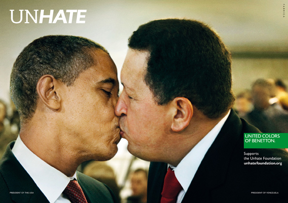
Benetton wants the world to UNHATE
A new campaign from Benetton recalls the brand's controversial heyday. A series of posters features world leaders with lips locked to launch the UNHATE project.
Benetton, says the accompanying press material, is inviting "the leaders and citizens of the world to combat the 'culture of hatred'". The UNHATE campaign is the first initiative from a new Benetton foundation of the same name, launched by Alessandro Benetton, executive deputy chairman of the Benetton Group.
At http://www.creativereview.co.uk/cr-blog/2011/november/benetton-unhate
Scott McCloud on comics
At http://www.ted.com/talks/lang/en/scott_mccloud_on_comics.html
In this unmissable look at the magic of comics, Scott McCloud bends the presentation format into a cartoon-like experience, where colorful diversions whiz through childhood fascinations and imagined futures that our eyes can hear and touch.