David A Smith is a name that has become synonymous in Sign-Writing and Glass gilding circles, with high quality, hand crafted reverse glass signs and decorative silvered and gilded mirrors. In this short documentary, we reveal behind the scenes work, techniques and visions that Dave uses when carrying out his passion as a glass embosser - One of the few remaining traditional UK glass artists.
Mostrar mensagens com a etiqueta type. Mostrar todas as mensagens
Mostrar mensagens com a etiqueta type. Mostrar todas as mensagens
terça-feira, 21 de fevereiro de 2012
Sign-Writing and Glass gilding

segunda-feira, 20 de fevereiro de 2012
domingo, 29 de janeiro de 2012
List of emoticons
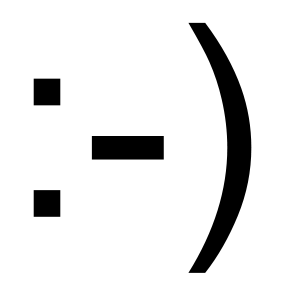
This is a list of notable and commonly used emoticons or textual portrayals of a writer's mood or facial expression in the form of icons. The Western use of emoticons is quite different from Eastern usage, and Internet forums, such as 2channel, typically, show expressions in their own ways. In recent times, graphic representations, both static and animated, have taken the place of traditional emoticons in the form of icons.http://en.wikipedia.org/wiki/List_of_emoticons
terça-feira, 24 de janeiro de 2012
Open source typography
If you’ve ever gone looking for legitimately free fonts, you’ve probably found that there are a lot of really bad ones. But there’s also a lot of discussion out there about “open source fonts.”http://magazine.redhat.com/2007/12/13/open-source-fonts/
The league of movable type

There are people who design typefaces for a living, and we want them to make money off of something that they do well. This revolution is not a movement against type foundries and type designers; it’s quite the opposite. The kind of revolution we want is a change in the way people think about doing business.http://www.theleagueofmoveabletype.com/
Open Font Library
The mission of the Open Font Library is to promote your freedoms as it relates to the use of type. All of the fonts that appear on this site come with the freedom to use, study, share and remix them.http://openfontlibrary.org/
domingo, 20 de novembro de 2011
Univers Revolved

Univers Revolved is a three-dimensional alphabet. It invites the readers to play with their imaginative mind and think beyond the conventions of their familiar reading method.http://universrevolved.com/4.About%20Univers%20Rev/Aboutframeset.htm
sexta-feira, 18 de novembro de 2011

terça-feira, 15 de novembro de 2011
segunda-feira, 14 de novembro de 2011
prototyp-0
L’application prototyp-0 est spécialement conçue pour le dessin de caractère. Grâce au procédé automatisé, prototyp-0 accélère considérablement le processus de création, permettant ainsi de générer dans un délai très court une multiplicité de polices typographiques complètes. Pour correspondre à ses critères, l’utilisateur pourra régler une vingtaine de paramètres (graisse, chasse, hauteur d’X, empattements, etc.)http://www.yannickmathey.com/prototyp
sexta-feira, 11 de novembro de 2011
Ubuntu Font Family
http://font.ubuntu.com/The Ubuntu Font Family are a set of matching new libre/open fonts. The development is being funded by Canonical on behalf the wider Free Software community and the Ubuntu project. The technical font design work and implementation is being undertaken by Dalton Maag.
Both the final font Truetype/OpenType files and the design files used to produce the font family are distributed under an open licence and you are expressly encouraged to experiment, modify, share and improve. The typeface is sans-serif, uses OpenType features and is manually hinted for clarity on desktop and mobile computing screens.
The scope of the Ubuntu Font Family includes all the languages used by the various Ubuntu users around the world in tune with Ubuntu's philosophy which states that every user should be able to use their software in the language of their choice. So the Ubuntu Font Family project will be extended to cover many more written languages.
http://www.google.com/webfonts/specimen/Ubuntu
http://en.wikipedia.org/wiki/Ubuntu_Font_Family
About Ubuntu Code of Conduct
quinta-feira, 10 de novembro de 2011
Helvetica and Alternatives to Helvetica
http://fontfeed.com/archives/helvetica-and-alternatives-to-helvetica/Helvetica is a classic. Helvetica is played out. Each of these statements is true to an extent. The world’s most recognizable typeface will soon star in a new film that documents both its omnipresence and its timelessness.
There are many reasons why Helvetica is so widespread. The most obvious being that a few weights have been bundled with the Mac OS for years. It is arguably the most respectable of the “default” fonts. But it’s also used because it’s a safe, neutral choice. For many purposes, typography is more about content than style. Fans of Beatrice Warde will tell you that typographers should communicate without distraction. Helvetica, with its simple, unadorned forms, is the perfect crystal goblet. Even its ubiquity contributes to its neutrality — letters so common they become invisible.
But invisibility isn’t always appropriate, particularly in advertising or branding where individuality is key. Here we recommend our favorite fonts from the grotesque genre that offer something different from Helvetica (or Arial) — whether it’s style, warmth, or extra features like small caps, figure alternates, and additional widths.
terça-feira, 8 de novembro de 2011
Arial & Helvetica


How to spot Arial
"Many of the characters in Helvetica and Arial are very similar to each other, although none are quite identical. Other characters are quite a bit different, and they are the key to telling which is which. Here are some of the most obvious ones (Grotesque 215, Arial’s ancestor, has also been included for comparison)(…)"
Arial versus Helvetica
"Every typeface, like every one of us, has its distinguishing features. You might be forgiven for thinking that some fonts are clones, or identical twins. However, closer inspection reveals subtle differences and nuances that simply escape casual perusal. Something that can really help to heighten our sensitivity to those differences is getting out our magnifying glasses and really taking a closer look."
The Scourge of Arial
"Arial is everywhere. If you don’t know what it is, you don’t use a modern personal computer. Arial is a font that is familiar to anyone who uses Microsoft products, whether on a PC or a Mac. It has spread like a virus through the typographic landscape and illustrates the pervasiveness of Microsoft’s influence in the world."
quinta-feira, 3 de novembro de 2011
segunda-feira, 31 de outubro de 2011
Unique Types
Nosewritten by Welab
Unique Types is a mobilization against prejudice. Using the fonts, you support AACD cause, showing the phisically disabled children can do almost everything other people can.
http://uniquetypes.cc/index_en.html
http://www.uniquetypes.cc/designers/index_en.html
sexta-feira, 21 de outubro de 2011
terça-feira, 18 de outubro de 2011
Christian Gessner
Manual de impressão do século XVIII com ilustrações feitas a partir de ornamentos tipográficos.
segunda-feira, 17 de outubro de 2011
Fotolia type ad

These ads contain no images, only typography and in no more than three colours — a bold move for a company that makes its money selling images.
(…)
Some typographers may critique the ads due to their hard-to-read nature, however, what might not be apparent is that this was, in fact, very intentional. What is unique about typography-heavy advertising is that it requires more from the viewer than passive observation; it requires an active participation — reading. The idea was to create a “block of type out of blocky type,” and in all caps, so that it required cognitive investment on the part of the reader, and made it memorable. Meadus figured that the writing was interesting enough that the readers wouldn’t mind being challenged to get through it, and “given the abrasive, pompous tone of voice, it was fitting that they be hard to read.”
http://www.typeforyou.org/2011/07/01/fotolia-bold-move-with-only-type-ad/Frankenfont

An edition of Mary Shelley's Frankenstein laid out using characters and glyphs from PDF documents obtained through internet searches. The incomplete fonts found in the PDFs were reassembled into the text of Frankenstein based on their frequency of use. The most common characters are employed at the beginning of the book, and the text devolves into less common, more grotesque shapes and forms toward the end.
Subscrever:
Mensagens (Atom)