quarta-feira, 18 de janeiro de 2012


Unevolved, reversed, and 8-bit brands

Unevolving a logo to just a series of coloured circles, how many can still be recognised? Logo and brands that have strong and unique colours, as well as strong positional aspects, are usually recognisable when Unenvolved to just circles.http://imjustcreative.com/unevolvedbrands/
http://www.flickr.com/photos/grahamsblog/sets/72157625155090078/

A Brand Reversion is a brand logo that has undertaken a creative change based on the visual style of another brand logo: Brand identities with a split personality
http://www.imjustcreative.co.uk/brandreversioning/
http://www.flickr.com/photos/grahamsblog/sets/72157626620633288/

quinta-feira, 12 de janeiro de 2012

quarta-feira, 11 de janeiro de 2012
Penguim

“It started with the simple logo and name, suggested, allegedly, by a typist who was earwigging the board meeting. Allen had already hit upon the idea of an animal logo, inspired by the template offered by the contemporary publishing house The Albatross Library. “It was the obvious answer, a stroke of genius,” said Penguin’s original designer, Edward Young. “I went straight off to the zoo to spend the rest of the day drawing penguins in every pose.” The clear logo was matched with the archetypal modern, but not too scarily modern, typeface, Gill Sans, and the now classic three-band cover, with colours related to the subject: orange for fiction, dark blue for biography, etc.”
At http://www.logodesignlove.com/penguin-logo

At http://dustyburrito.blogspot.com/2009/12/penguin-group-logos.html


terça-feira, 10 de janeiro de 2012
logoorange.com
Este site faz um resumo da história das marcas mais conhecidas por ordem alfabética:
(aqui fica a minha homenagem à pobre Kodak)

kodak logo design history
Established by businessman Henry Strong and inventor George Eastman, Eastman Kodak in an American multinational public company known for producing and supplying a wide array of photographic equipment and materials. Eastman preferred the letter K for it seemed an incisive, strong sort of letter. In 1960, the company introduced the corner curl. The graphic "K" element was not introduced until the 1970's along with the box. The year 1987 saw a further update of the logo as a more contemporary type font replaced the old one. Eastman Kodak Co. has recently introduced a new corporate symbol created to help the company contrive a new image as an up-to-date, 21st century groundbreaker. Kodak was forced to reinvent itself and that led to an enhancement of the corporate image. So we can see how Kodak breaks out of the box busting out a new corporate identity to replace their 50-year old current one. The new logo features a distinctive "a" and a rounded type font. Today's new, symplified Kodak logo keeps the company's distinctive yellow and red colours but dispenses with the box that has comprised the word "Kodak" for the past 70 years.
http://www.logoorange.com/logodesign-A.php
(aqui fica a minha homenagem à pobre Kodak)

kodak logo design history
Established by businessman Henry Strong and inventor George Eastman, Eastman Kodak in an American multinational public company known for producing and supplying a wide array of photographic equipment and materials. Eastman preferred the letter K for it seemed an incisive, strong sort of letter. In 1960, the company introduced the corner curl. The graphic "K" element was not introduced until the 1970's along with the box. The year 1987 saw a further update of the logo as a more contemporary type font replaced the old one. Eastman Kodak Co. has recently introduced a new corporate symbol created to help the company contrive a new image as an up-to-date, 21st century groundbreaker. Kodak was forced to reinvent itself and that led to an enhancement of the corporate image. So we can see how Kodak breaks out of the box busting out a new corporate identity to replace their 50-year old current one. The new logo features a distinctive "a" and a rounded type font. Today's new, symplified Kodak logo keeps the company's distinctive yellow and red colours but dispenses with the box that has comprised the word "Kodak" for the past 70 years.
http://www.logoorange.com/logodesign-A.php
Brand New

segunda-feira, 9 de janeiro de 2012
Benetton Again

At http://www.creativereview.co.uk/cr-blog/2006/october/benetton-hits-middle-age
In the history of attention-getting advertising, writes Rick Poynor, Benetton must surely deserve a place as one of the most effective companies ever to splash its promotional message across a billboard or magazine spread.
Benetton wants the world to UNHATE

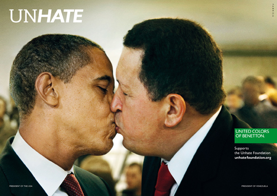
A new campaign from Benetton recalls the brand's controversial heyday. A series of posters features world leaders with lips locked to launch the UNHATE project.
Benetton, says the accompanying press material, is inviting "the leaders and citizens of the world to combat the 'culture of hatred'". The UNHATE campaign is the first initiative from a new Benetton foundation of the same name, launched by Alessandro Benetton, executive deputy chairman of the Benetton Group.
At http://www.creativereview.co.uk/cr-blog/2011/november/benetton-unhate
Scott McCloud on comics
At http://www.ted.com/talks/lang/en/scott_mccloud_on_comics.html
In this unmissable look at the magic of comics, Scott McCloud bends the presentation format into a cartoon-like experience, where colorful diversions whiz through childhood fascinations and imagined futures that our eyes can hear and touch.
Subscrever:
Mensagens (Atom)