Vale a pena uma espreitadela: http://romualdofaura.com/


At http://www.creativereview.co.uk/cr-blog/2006/october/benetton-hits-middle-age
In the history of attention-getting advertising, writes Rick Poynor, Benetton must surely deserve a place as one of the most effective companies ever to splash its promotional message across a billboard or magazine spread.

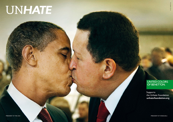
A new campaign from Benetton recalls the brand's controversial heyday. A series of posters features world leaders with lips locked to launch the UNHATE project.
Benetton, says the accompanying press material, is inviting "the leaders and citizens of the world to combat the 'culture of hatred'". The UNHATE campaign is the first initiative from a new Benetton foundation of the same name, launched by Alessandro Benetton, executive deputy chairman of the Benetton Group.
At http://www.creativereview.co.uk/cr-blog/2011/november/benetton-unhate
At http://www.ted.com/talks/lang/en/scott_mccloud_on_comics.html
In this unmissable look at the magic of comics, Scott McCloud bends the presentation format into a cartoon-like experience, where colorful diversions whiz through childhood fascinations and imagined futures that our eyes can hear and touch.
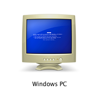
That’s how the icon for a computer with Windows looks in a networked environment of Macs. The joke by the designers10 Outstanding Metaphors in Icon Designfilibustersat Apple was a little obscure, but a bit coarse.
Once, we needed an icon for a data filter, which is often portrayed using the metaphor of a funnel. It was drawn like this:10 Mistakes in Icon DesignThe client’s response was as follows: “I do not really understand why for a filter, you drew an icon shaped like a Martini glass!”
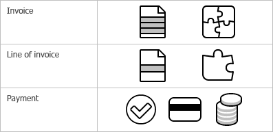
The surefire way of creating a set of icons falling apart along the way is to start generating icons one after another, in the alphabetic order, without looking ahead and with no clear vision of the whole picture. The opposite approach is what we call “designing an iconic language”. This method is described in details in the book by William Horton, “The Icon Book”. And now I will try to demonstrate you an example of what it is and how it is implemented.Designing an iconic language
Does that mean that the only useful function of icons is to help users with dull sight? In fact, no. But this example demonstrates that an icon unlike text can have properties for locating it on the screen. These properties are shape and color. Text messages are not different from each other by shape or color. To distinguish one message from another you need to read it. In the event with icons, you need just a quick glance.What icons are for

The Privacy Icon makes an iron-clad guarantee about some portion of how a company treats your data. This method means that without ever having to delve into the details, everyday people can glance at the simple icons atop a privacy to know if and how their data is being used. At the same time, it gives companies the flexibility required to create comprehensive and meaningful policies.
http://www.azarask.in/blog/post/privacy-icons/
http://www.azarask.in/blog/post/what-should-matter-in-privacy/
Informam-se todos os discentes que os prazos da proposta de trabalho 4 foram alterados para:
Entrega em formato digital: 14/12/2011, 19:00;
Apresentação: 15/12/2011, 8:30 AM.

These maxims are really a super concise and clear way of restating one of the founding tenets of so-called design thinking: The idea of creating prototypes as soon as you can, and failing as fast as possible so you can evolve your way to something great. It isn't to say that you have to make these failures public. But the failures have to be made and not just thought about. Get it done.http://www.fastcodesign.com/1665527/infographic-of-the-day-13-rules-for-realizing-your-creative-vision